What Makes Apartment Website Design Work? These 6 Properties Get It Right
From transparent pricing to interactive maps, these picks show how design can support a clearer path from research to leasing.
Good apartment website design must answer the most important questions in a few clicks: What does the community look like? Which apartments and floor plans are available? What’s the cost? Where is the property located?
For many renters, the website is an important step between discovering a community and contacting its leasing team. According to recent surveys, 79 percent of prospective renters checked a website during their most recent search. A good visual representation of the community can influence whether they remain on those pages long enough to find what they need. Google research found that people begin forming an opinion about a website’s appearance after seeing it for as little as 50 milliseconds. Other studies showed that people search more efficiently on simple websites rather than highly complex ones.
So, what’s the sweet spot when it comes to apartment website design? It cannot rely on appearance alone and it must organize information around renters’ questions, communicate what makes the property different and provide a clear path toward tours and the application process.
READ ALSO: Multifamily Marketing’s New Look: From Listings to Infrastructure
Website design in practice
We have compiled a list of websites that cater to different markets, property types and resident profiles, but still make apartment website design work. Preleasing sites rely on virtual tours, affordable communities put eligibility requirements first and student housing properties provide more details about pricing and fees. Several have already received industry awards, while others stand out for how they organize information and guide prospects through the apartment search.
The Sutton keeps luxury simple

Most often, websites of luxury communities lean on high-quality visuals, elaborate animations and a long amenity list. The Sutton, Northland’s community in Atlanta’s Buckhead neighborhood, takes a more controlled approach. The simple interface, which shows luxury without making basic information difficult to find, won Gold in the Best Website category at MHN’s Excellence Awards back in 2024.
The homepage uses a moderate color palette and prominent property photography to establish the brand. At the same time, it keeps three primary actions easy to identify: exploring floor plans, booking a tour and applying for a lease. The amenity presentation is similarly selective, drawing attention to features such as the fitness center, concierge service and elevated saltwater pool deck rather than presenting visitors with an extensive list all at once.
The website also includes controls that allow visitors to modify contrast, saturation and text size. These tools do not replace broader accessibility practices, but their prominent placement shows that accessibility was considered as part of the visitor experience.
Monmouth Row creates several paths toward leasing
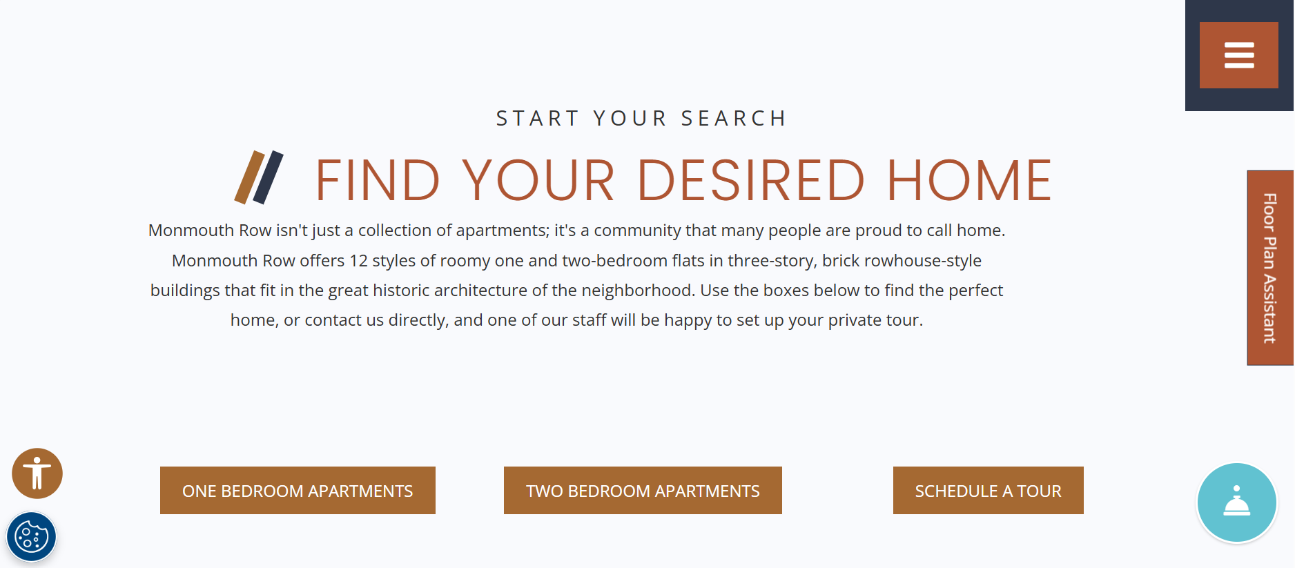
Not every visitor arrives at a property website at the same stage of the apartment search. Some are ready to schedule a tour, while others are still comparing floor plans, neighborhoods, or amenities. Monmouth Row, a Towne Properties community in Newport, Ky., accounts for those differences by distributing several routes through its homepage.
Visitors can go directly to available apartments, search specifically for one- or two-bedroom homes, open an interactive property map, explore the neighborhood, or schedule a tour. The labels are direct and task-oriented. Rather than asking renters to interpret a creative navigation system, the website uses phrases such as “See Available Apartments,” “Find Your Desired Home” and “Get Directions.”
Information about downtown Cincinnati, nearby destinations and the property’s rowhouse-style buildings helps connect the apartment search to the surrounding area, making it another award-winning website at MHN’s 2024 Excellence Awards.
Presidio Residences simplifies an extensive portfolio
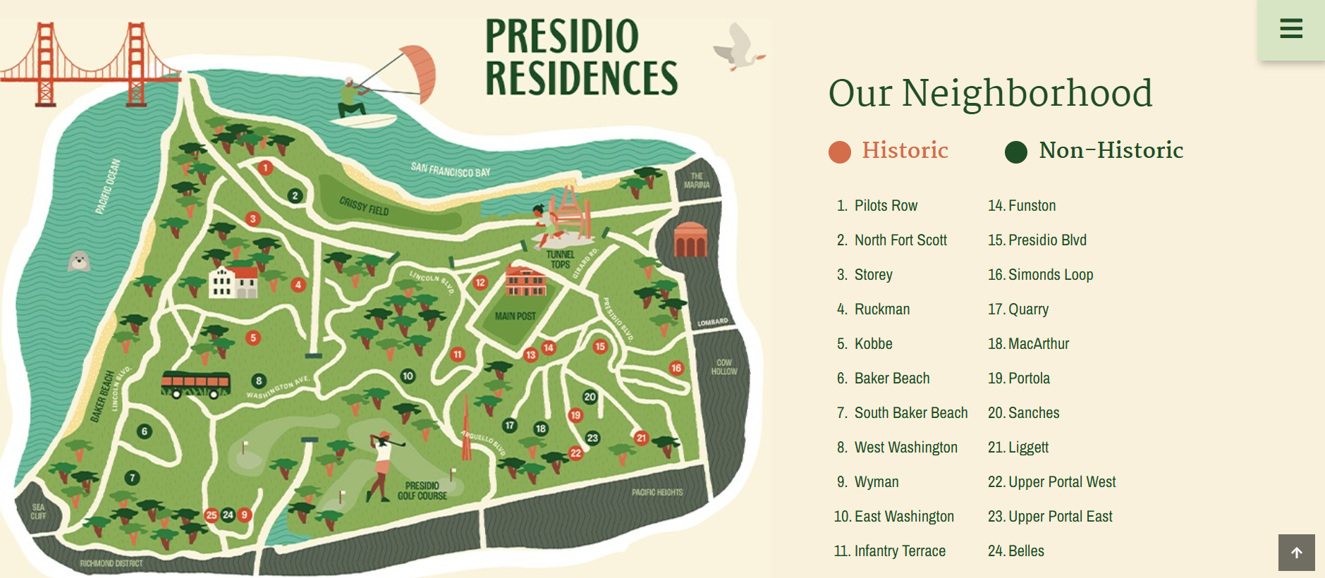
While most apartment websites introduce a single property, Presidio Residences must organize 25 neighborhoods within San Francisco’s Presidio, including historic housing. Its approach received an honorable mention in the website design category of the 2026 Hermes Creative Awards for the way it divides a complex portfolio into manageable decisions without requiring visitors to understand the organization’s internal structure.
Instead of treating the portfolio as one long catalog, the website structures it as a series of choices. Prospects can begin by learning about the Presidio, browse neighborhoods by housing category, or go directly to homes that are available or coming soon. An interest form provides another route for visitors who have not yet identified a specific residence.
The website also includes useful information such as rental rates, resident selection guidelines, frequently asked questions and a resident handbook. Separate contact details for different leasing offices also help visitors navigate a portfolio covering several areas.
The Beaumont makes eligibility part of the main story
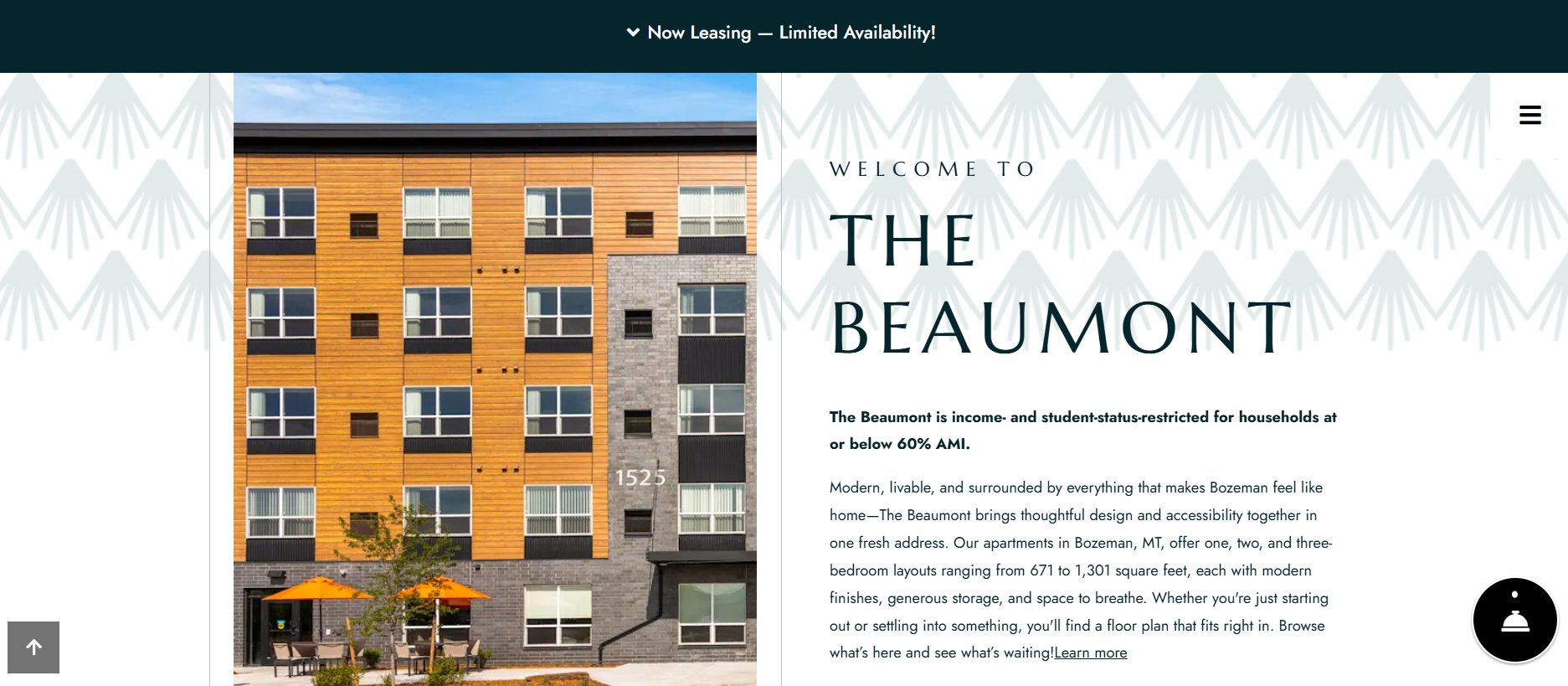
Eligibility requirements are essential information for affordable housing prospects, but they can sometimes be buried in frequently asked questions, downloadable documents or application instructions. The Beaumont, a Roundhouse community in Bozeman, Mont., places that information on its homepage. The website states that the property is income- and student-status-restricted and serves households earning no more than 60 percent of area median income.
That disclosure appears alongside the community’s photography and its “Check Availability” and “Apply Now” buttons. Prospects can determine whether the property may fit their circumstances before spending time reviewing floor plans or beginning an application. The remainder of the website moves through the property’s apartments, amenities, neighborhood and virtual-tour option. Details about Montana State University, downtown Bozeman and nearby outdoor destinations help explain the location without obscuring the community’s affordability requirements.
The Beaumont’s website also received Gold at the 2025 Hermes Creative Awards and its value lies in treating eligibility as part of the renter’s experience rather than a disclosure at the end.
READ ALSO: How Self-Service Leasing Is Reshaping the Renter Journey From Search to Sign
Rambler ATX answers students’ practical questions
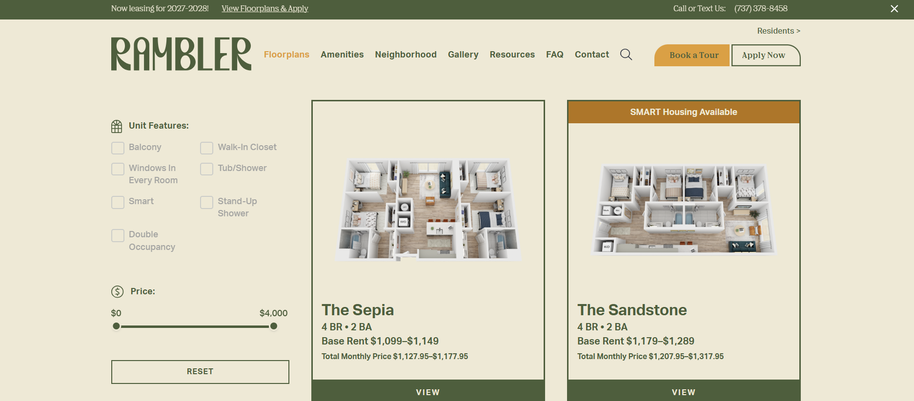
Student housing websites must often explain more than the apartment itself. Residents may be comparing several bedroom configurations, individual leases, roommate arrangements, mandatory fees and housing options they cannot visit before making a decision. Rambler ATX, LV Collective’s student housing community near the University of Texas at Austin, brings much of that information into the search experience. Renters can filter floor plans by move-in date, bedroom count, availability and unit features such as balconies, walk-in closets or double-occupancy options.
The results distinguish between base rent and total monthly pricing, which includes fixed mandatory fees. The website also identifies units available through Austin’s SMART Housing program and publishes informational content addressing topics such as one-time fees, moving, rent reporting and nearby destinations.
Rambler’s website was created as part of a broader mobile-first campaign that received the Grand Award for Marketing and Advertising in the 2024 Multifamily Executive Awards. The campaign included social media, advertising, email and the website, so its results cannot be attributed to one channel. Still, the property’s digital leasing performance was notable: Multifamily Executive reported that 52 percent of leases came from renters who had not taken a tour.
1000M uses interactive tools to explain a high-rise
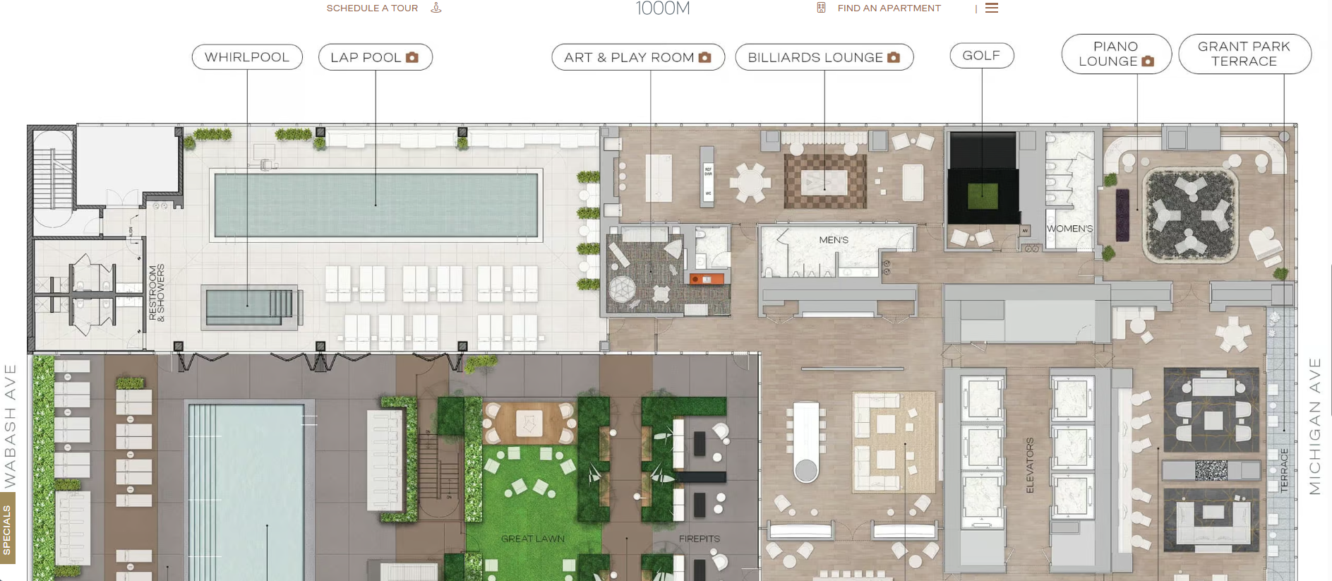
Luxury towers often offer dozens of floor plans, amenity levels and view orientations. A conventional photo gallery may establish the look of the building but provide little help in understanding how those elements relate to one another. The website for 1000M, a Chicago tower managed by Willow Bridge, gives visitors several ways to examine the property.
In addition to a traditional floor plan search, it offers an amenities-by-floor map, interactive views and separate pathways for residences, penthouses and the building’s art program. This approach is particularly relevant for a property with more than 80,000 square feet of indoor and outdoor amenities spread across several levels. Rather than presenting the features as an undifferentiated list, the website connects them to their physical location within the tower.
The property’s primary leasing actions remain visible despite the volume of material. Visitors can find an apartment, schedule a tour, or apply directly, while those who are still researching can explore the architecture, neighborhood and views. The website has received recognition from the Web Excellence Awards and a Silver w3 Award, as well as a CAMME Award for Best Property Website due to its interactive features that help translate the scale of a high-rise into information a renter can use.
READ ALSO: What Zillow’s ‘Playbook’ Reveals About Listings
Why these apartment websites work
The six websites take different visual approaches, but their design choices address similar leasing challenges. Each gives renters clear paths to floor plans, neighborhood information, availability, tours, or applications without presenting every action as equally urgent. Their content is also specific to the property, whether explaining income requirements at The Beaumont, distinguishing base rent from total monthly pricing at Rambler, or organizing Presidio Residences’ portfolio by neighborhood.
Interactive features also serve practical purposes. Monmouth Row’s map clarifies the community layout and 1000M’s amenities map helps prospects navigate a vertical building. At the same time, the websites connect branding to location and audience, from The Sutton’s emphasis on Buckhead luxury to Rambler’s focus on student life near the University of Texas.
Designing a good website, however, does not guarantee that the experience remains effective after launch. Pricing, availability, concessions and renter behavior continue to change, so operators must monitor where visitors enter the site, which information they use and where they abandon the process. Ultimately, a good website must reduce uncertainty. While good visuals may catch a prospective renter’s attention, having clarity is what makes them proceed with their leasing journey.