3 Apartment Website Myths Multifamily Marketers Should Rethink
Renters increasingly rely on property websites, but outdated approaches to technology, design and optimization can create friction throughout the leasing journey.
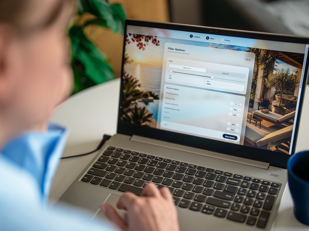
A property website can turn a potential renter’s interest into a lead—or send them looking elsewhere. Yet it remains one of the most overlooked pieces of the leasing funnel.
Renters may discover a community through an ILS, social media, paid search or a recommendation, but the property website is often where they go to validate that first impression. According to the 2024 NMHC/Grace Hill Renter Preferences Survey, 79 percent of renters visited a property website during their most recent apartment search.
READ ALSO: What Old-School Renter Marketing Still Works?
That puts a lot of pressure on a relatively small piece of digital real estate. It also raises a question: What actually makes an apartment website effective?
There are plenty of assumptions about what a multifamily website needs to be successful. It needs to be custom-built. It needs to carry a premium price tag. It needs to be fully optimized before launch.
Not necessarily. So, here are three common apartment website myths worth reconsidering.
Myth No. 1: Native is always better than integrated
In multifamily technology, “native” can sound like the gold standard.
The logic is straightforward: If everything lives within the same platform, the experience should be more seamless. But for apartment websites, the real issue isn’t whether a particular feature is native. It’s whether the technology behind the site works together.
A property website can connect with a leasing platform, CRM, ILS, pricing and availability tools, tour scheduling, chat and other systems. The prospect doesn’t need to know which pieces are native and which are integrated. They simply need the experience to work.
As technology stacks become more complex, integration quality can have a greater impact on the renter experience than whether a particular tool is native.
The 2025 Customer Experience Technology Survey Report from the Real Estate Technology and Transformation Center and Newmark, conducted in collaboration with NMHC and RCKRBX, points to continued industry interest in technology consolidation and integration as operators look for more connected customer experiences.
For marketers, the question should therefore be less about where a particular function lives and more about what happens when a prospect uses it. Can they see current availability? Can they move from a floor plan to pricing without starting over? Can they schedule a tour without encountering another login or an outdated page? Does a lead make it to the right team?
A website can be built almost entirely with native functionality and still provide a frustrating experience. Conversely, a well-integrated technology stack can make several different systems feel like one.
The takeaway: Don’t evaluate a website by how much of it is native. Evaluate it by how little friction the renter encounters.
Myth No. 2: Good design has to be expensive
There is a tendency in multifamily to equate a premium website with a premium price tag.
Custom photography, elaborate animations, bespoke layouts and highly designed landing pages can certainly create an impressive first impression. But aesthetics alone don’t make a website effective.
For an apartment shopper, good design is often much more practical. It’s finding a floor plan quickly, seeing current availability and pricing, and knowing exactly how to schedule a tour.
READ ALSO: The 3 Biggest Apartment Marketing Trends
That’s particularly important because renters are increasingly accustomed to handling major parts of the leasing process digitally. Today’s renters move quickly and expect detailed, easy-to-access information throughout the apartment search.
This doesn’t mean operators should cut design from their website budgets. It means they should be more deliberate about where those dollars go.
A beautifully designed homepage won’t make up for outdated inventory. A sophisticated animation won’t help if the CTA is buried. And a site that looks great on a desktop but performs poorly on mobile isn’t doing much for the renter who is searching between errands.
The best apartment websites aren’t necessarily the ones that look the most expensive. They’re the ones that make the search feel easy. That distinction is particularly relevant for operators managing large portfolios. A website strategy that looks impressive at launch but is difficult to update across dozens or hundreds of communities can become a liability.
The takeaway: Invest in design that removes friction, not simply design that adds visual polish.
Myth No. 3: Website optimization ends at launch
Launching a new apartment website can feel like the finish line. The pages are live. The SEO is in place. Tracking is installed. The team has signed off.
Then everyone moves on to the next project.
But renter behavior doesn’t stop changing just because the website has launched. Neither does the property. Availability changes. Pricing changes. Concessions change. New competitors enter the market.
Search behavior shifts.
A floor plan that was a priority last quarter may be sitting empty today. A page that generated strong traffic may suddenly become less relevant. In other words, a website can be technically “finished” while its marketing job is never finished.
Resi’s 2025 Multifamily Marketing Guide similarly frames the property website as an ongoing part of the digital leasing experience rather than a static brochure, emphasizing user experience, integrations and conversion.
Optimization doesn’t necessarily mean commissioning another redesign every year. It can be much more granular: changing a CTA, updating copy, improving internal links, replacing outdated photography, fixing a broken form or making availability easier to find.
The data can point marketers toward those opportunities: Where are prospects entering the site? Which pages do they visit? Where are they dropping off? Which communities generate the most engagement? Are visitors reaching the pages that matter—or getting stuck along the way?
Those questions can turn a website from a static marketing asset into an active source of leasing intelligence. And sometimes, the smallest changes are the most useful.
The takeaway: A website launch should mark the beginning of optimization, not the end.
Rethinking the apartment website
None of this means operators should abandon native technology, spend less on design or avoid comprehensive website launches. The point is to rethink what those investments are supposed to accomplish.
An apartment website doesn’t exist to win a design award or demonstrate how much technology a company has purchased. It exists to help a prospective resident make a decision. That requires accurate information, intuitive navigation, functioning technology and a clear path to the next step.
For multifamily marketers, that may mean asking different questions when evaluating a website: Are the systems connected? Can renters find what they need quickly? Are we learning from how people actually use the site?
The strongest website strategy may not be the one with the most features or the biggest launch budget. It may simply be the one that keeps making it easier for renters to say, “I’d like to see this apartment.”