
MHN Interview: Jill Pilaroscia on the Art and Science of Multifamily Color Choices
Colour Studio offers full service color consulting for exterior and interior color selection. An 'art and science' approach takes into consideration the architecture, site, geographic location and the demographic profile of the users.

Jill Pilaroscia, Principal, Colour Studio
By Diana Mosher, Editorial Director
As successful multifamily investors already know, interior and exterior color choices have much to do with how an apartment asset is received by renters in the marketplace. An energetic color can revive a tired property and a sophisticated palette can attract an upscale demographic. Color is also key when considering how a new construction will fit into an existing neighborhood. I recently talked to color consultant Jill Pilaroscia, Principal of San Francisco-based Colour Studio Inc., about her work with the apartment industry.
MHN: What types of services does Colour Studio offer?
Pilaroscia: Colour Studio offers full service color consulting for exterior and interior color selection. Our art and science approach takes into consideration the architecture, site, geographic location and the demographic profile of the users. We craft memorable and unique color solutions, which enhance the value of our client’s investment.
We produce fully colored architectural elevations for new construction to facilitate the owner’s ability to obtain public and city approvals. For existing architecture being renovated or repositioned, we work in color on digital photographs.
MHN: How can color choices impact curb appeal for multifamily owners/investors/developers and profitability in terms of leasing and occupancy?
Pilaroscia: During the economic downturn very few housing projects were breaking ground. Owners and investors of multifamily rental properties began to use color and paint to reposition their portfolio to attract tenants who might otherwise have been thinking about buying a new home. In order to get top rents, owners understood properties needed to look fresh and well maintained.
Currently the housing market is picking up and developers want to jump on the approval bandwagon and get their projects entitled. Some of them have been sitting on deals and time equates to money for them. Color is frequently a sticking point in the architectural review process. Having a color professional on board who presents color using an objective art and science approach can sell the color ideas more quickly to city agencies.
With people scrambling for housing to rent or buy, curb appeal is a huge benefit. Well-colored projects are memorable and can suggest a lifestyle choice that is appealing to end-users.
MHN: Do you mainly work on new developments or rehabs/renovations?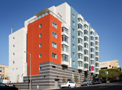
Pilaroscia: We do both types of projects on a regular basis and both markets have become very active this year.
MHN: What interesting color trends are you seeing now that you think the multi family industry should be aware of?
Pilaroscia: As projects become more transit friendly, and celebrate density, consumers still want their residence to have a sense of place. They want to identify with their individual unit, or their development. Variety in color placements is a trend that is here to stay.
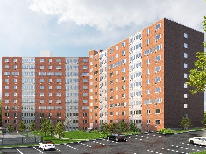
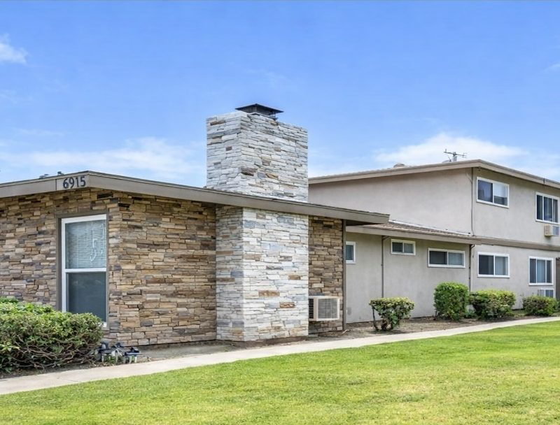
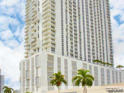
The earth tone trends of gold, terra cotta and tans that paired well with browns popular 10 years ago are giving way to more vibrant and saturated colors. It is not unusual to see deep reds, oranges, brilliant yellows and blues popping up on buildings paired with whites and a range of grays. We are also seeing variety in cladding materials and innovative textures—metal panels with perforations, reveals and shingle like characteristics, as well as stone cladding, custom glazing and window sizing and imaginative balcony details.
No matter what the color trends are, to be successful in the marketplace, a building has to look attractive in its setting and the colors need to reinforce the architectural style and the materials used in construction.
MHN: What is color blocking? Is this only popular in certain parts of the country?
Pilaroscia: Color blocking is a creative tool for color consultants, and I believe is applicable to housing stock all over the country.
Color blocking can be used to break down the scale and mass of large buildings. On a block long elevation we can use a deeper color to announce the start and finish of the elevation, allowing for medium and light value colors to orchestrate the central section of the building. In townhome or single-family developments, color blocking of the individual homes creates variety as one navigates the community. We pay careful attention to not place two homes of the same color adjacent to one another. On medium to high-rise multi family projects, color blocking can be used to unify and brand a site.
MHN: Do you ever glean ideas from other parts of the world? If so why and where?
Pilaroscia: Many cities in Europe have color guidelines that have been evolved over time and are respectful of the regions geographic and cultural characteristics. Historically buildings were made from regional materials. The building colors reflected the soils, and stones found in that specific area. These buildings all sit handsomely in their setting and with on another.
Some cultures favor strong color in their architectural environment. The colors may or may not translate successfully to other areas due to the light and surrounding landscape. Imagine South Beach colors in Seattle, or Southwest colors in Maine. The housing styles and the regional light will not support color palettes to travel indiscriminately.
Buildings should strive to be all that they can be. There is no one formula that you can count on for success in architectural coloring. By looking objectively at the factors that influence a successful design outcome, color will maximize your investment. I guarantee it.