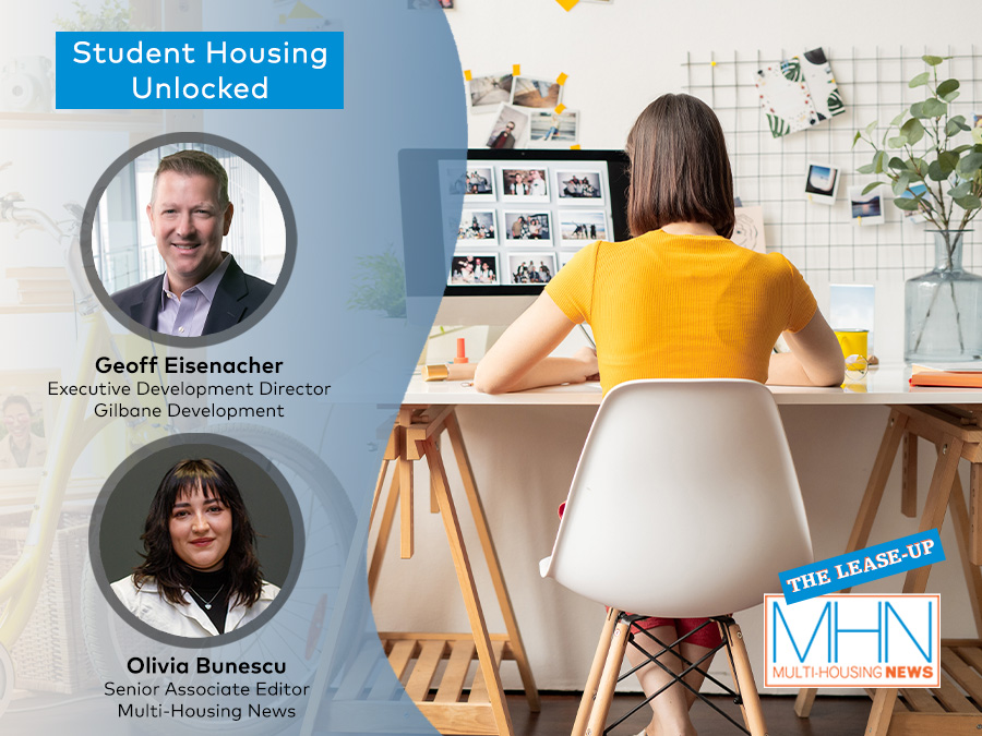

Why Less Is More in Multifamily Design Today
Design experts share how flexibility, longevity and intention are shaping the next generation of spaces that residents love.
In its purest form, minimalism is guided by a few core principles: intentionality, quality over quantity, simplicity and functionality. In practice, that translates less into adding and more into editing, making deliberate choices about what truly belongs in a space.
That mindset is reshaping how many multifamily interiors are being conceived today. Rather than replicating a flashy magazine aesthetic, developers and designers are prioritizing durable materials and thoughtful specifications that reduce long-term maintenance without sacrificing experience. At the same time, instead of carving out new amenity spaces, teams are increasingly focused on maximizing the performance of what already exists.
The shift marks a departure from years when multifamily interior design competed on the length of its amenities list. In the postpandemic landscape, resident preferences have evolved. Experience now outweighs excess, with greater demand for flexible layouts, modular furnishings, purposeful spaces and materials built to last.
READ ALSO: Top Priority for Renters: Simple and Practical Amenities
“Less is more” doesn’t mean sparse or monochrome—it means intention. As Dan Mazzarini, principal & creative director of Mazzarini & Co., put it, the approach addresses underutilized areas within buildings or units and brings together elements that “respond directly to how people live in a space.”
At V Starr, Director of Strategy & Principal Enrique Vela describes the concept as disciplined amenity planning. The focus is on curated features that align with residents’ daily routines rather than one-size-fits-all checklists.
“The philosophy is also about using the dollars not spent on underutilized amenities to add functional space for residents and provide upgraded finishes,” noted Sonya Haffey, the firm’s CEO.
For Philip Consalvo, principal at PJCArchitecture, the same philosophy plays out through planning and lifecycle cost analysis. It centers on creating architecturally fluid layouts that reduce visual clutter and maximize natural light, identifying operational pain points for both management and residents, and reworking existing conditions to limit waste and control long-term expense.
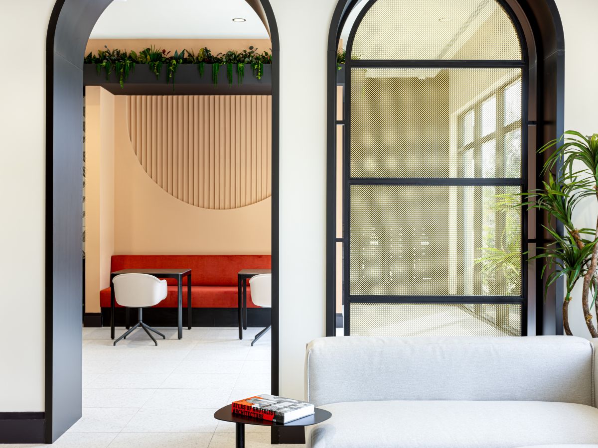
Designing amenities for use, not optics
In a “less is more” design framework, amenity planning becomes an exercise in pragmatism. The goal is not to impress on paper, but to measure how spaces are actually used and invest where engagement is strongest. Work lounges, multipurpose rooms, generous outdoor areas and service touchpoints that reduce friction are increasingly outperforming flashier, single-use amenities because they feel purposeful.
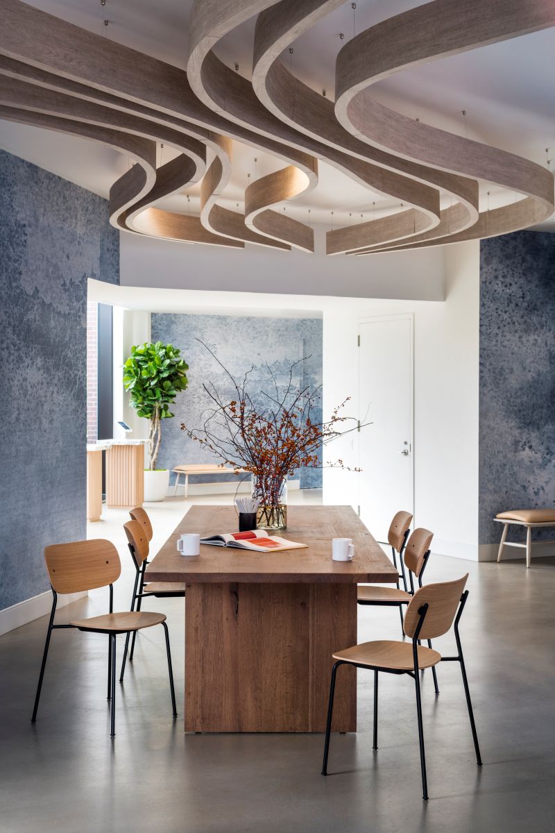
The Maybury, Gotham Organization’s 453-unit tower at 550 10th Ave. in Manhattan, illustrates this approach. Working with Mazzarini & Co., the team designed a multipurpose lounge intended to support residents throughout the day—from coffee to cocktails. Power outlets were integrated directly into the furniture, and a mix of seating types allows the space to function as a focused work environment during the day and a social setting in the evening, effectively delivering two uses within one room.
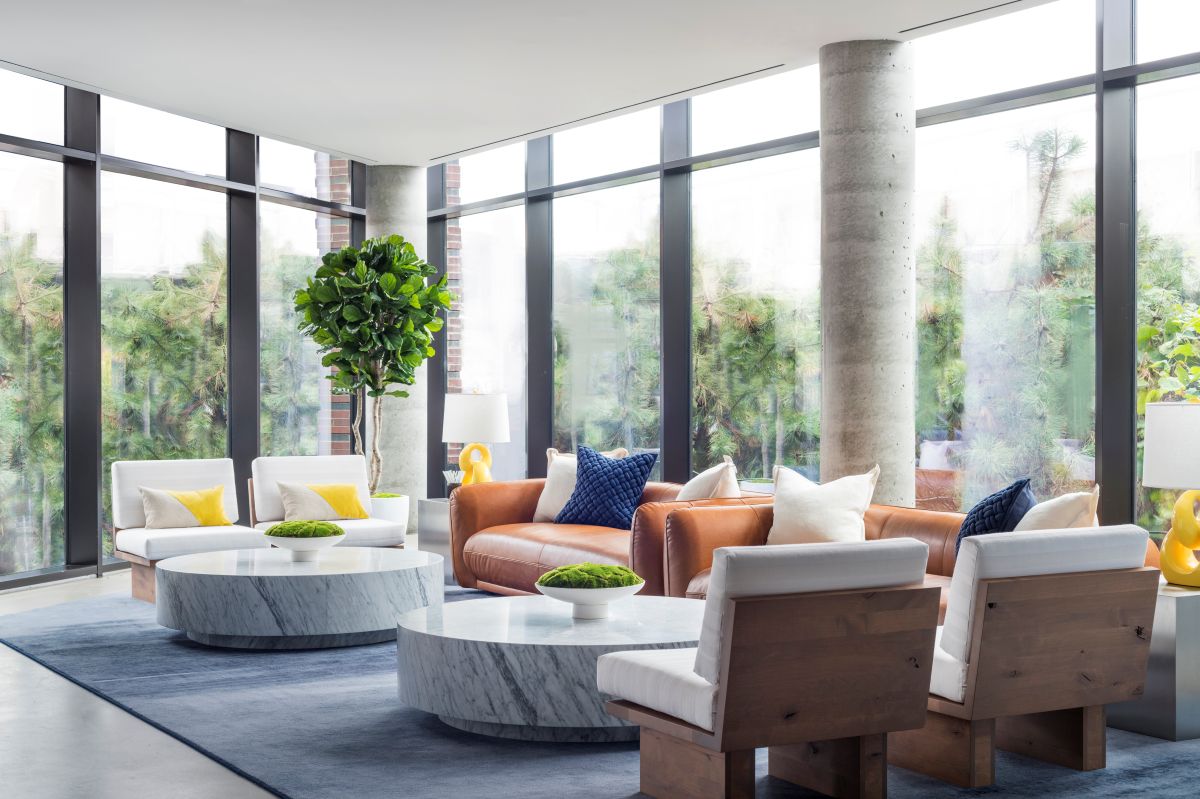
That kind of flexibility often proves more valuable than long amenity lists. Usage patterns, designers note, consistently show that a small number of well-designed spaces can outperform broader offerings when it comes to resident engagement. “Time of day use is an important consideration in all project sectors,” said Mazzarini. “We’re continuing to imagine how people function during the day versus after hours to ensure we’re anticipating their needs.”
A similar philosophy shaped Modera Coral Springs, one of Mill Creek’s communities in Florida. There, V Starr adopted a cleaner, more purpose-driven approach by designing a hotel-inspired lobby that also functions as a coworking space. The design relies on a neutral palette, with accent details introduced through furniture and elements such as lamps and books, allowing the space to feel layered without visual excess.
“One of the greatest challenges is convincing the client that you don’t need to keep up with the local competitors’ amenities and less is more,” said Haffey. In her view, relevance consistently outweighs volume: The most successful amenities are those residents return to again and again.
Beyond aesthetics, designers say this pared-back approach also helps owners avoid overcapitalizing on features that quickly fall out of favor, while making future updates simpler and more cost-effective.
Durable materials, lasting impact
The same emphasis on relevance and restraint extends beyond how spaces are programmed to how they are built. Designers are increasingly prioritizing cleanability and durability, qualities that benefit both residents and owners over the long term. Visually heavy interiors that chase short-lived or micro trends can date quickly, while timeless materials tend to perform better across market cycles. That, however, doesn’t mean sterile or bland.
“We love adding something a little ‘crusty and dusty’ to our concepts,” explained Dan Mazzarini. “Heritage pieces instantly elevate a space and bring everything to the same level to make a room feel finished, intentional and lived in.”
So, rather than layering on costly design elements, the focus shifts to adding character with purpose. Biophilic features, along with tactile textures, can enhance comfort and warmth without overwhelming the space visually, reinforcing the idea that personality doesn’t require excess.
Designers stress that “less is more” is not about cutting corners, but about making deliberate decisions about where quality matters most.
“We opt for durable, low-maintenance materials like marble, porcelain, ceramic, or concrete, which elevate the property’s aesthetic while reducing long-term maintenance,” said Consalvo.
Artwork is another effective tool within this pared-back approach. Because it can be easily updated or rotated, it offers a flexible way to refresh interiors over time without major capital investment.
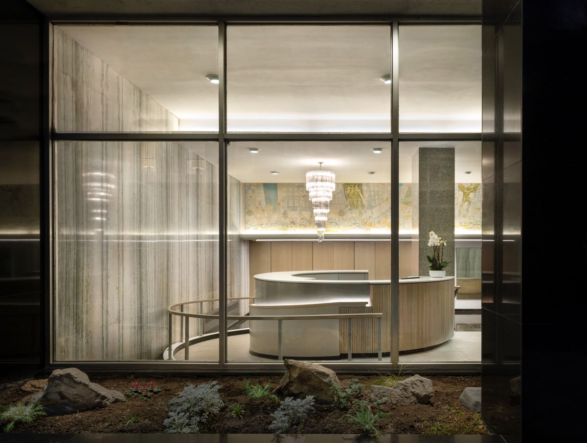
Those principles are evident in PJCArchitecture’s lobby project on East 33rd Street in Manhattan. Instead of removing existing finishes, the design team preserved the original marble walls and terrazzo floors, introduced an ADA-compliant ramp that doubles as a new reception element and concealed storage within minimalist millwork.
“In combining these elements, we created a natural flow throughout the space, while allowing more natural light to flood the lobby to highlight the materiality and texture of the design,” added Consalvo.
Smaller units, smarter design
If common areas set the tone for a building, apartments are where minimalist design most directly shapes daily life. In-unit design is also where budget discipline becomes unavoidable when applying a “less is more” approach.
“Apartments tend to be smaller in scale, so you have to be judicious about where you spend the dollars,” said Mazzarini. His recommendation is to establish a clear hierarchy of what matters most to both residents and owners, then allow a few high-impact elements to anchor the space while everything else quietly supports them.
In dense urban markets such as New York, where PJCArchitecture is active, spatial efficiency is driven by layout rather than size alone. The firm favors open, architecturally fluid plans that merge kitchen, living and dining areas to pull natural light deeper into the unit and eliminate dead corners. Separation is achieved through custom millwork and built-ins, rather than additional walls.
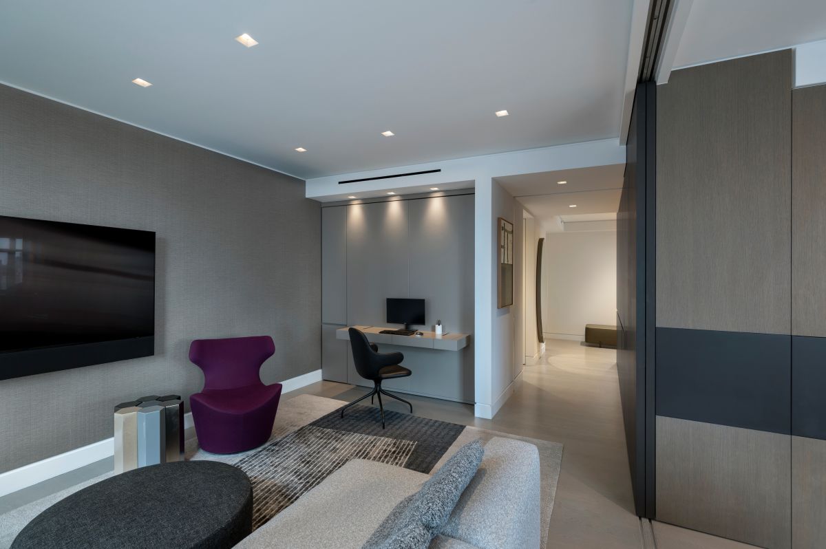
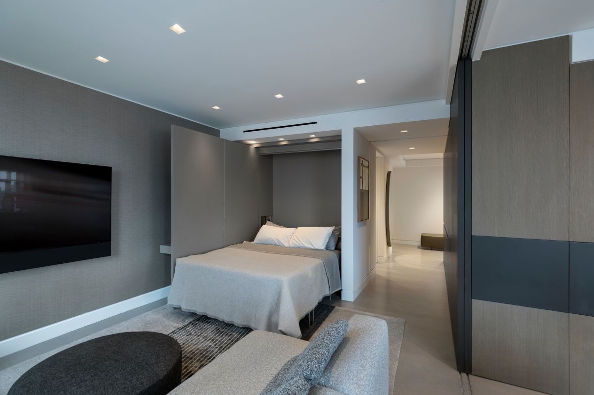
“We’ve integrated Murphy beds into built-in desks, concealed kitchen home offices behind pocket doors and transformed entire entryways into closets for shoe collections,” Consalvo said.
Additionally, with affordability remaining a pressure point, residents’ expectations around how efficiently each square foot performs have sharpened. That efficiency often extends beyond the unit itself. V Starr’s team, for example, points to amenity frameworks that add value without adding rooms—supporting resident needs through shared or flexible offerings rather than expanding private square footage.
READ ALSO: Understanding Your Residents: Remote Workforce
What can support these goals is thoughtfully integrated technology, Consalvo noted. “When done right, no space is left underutilized.” While some of these solutions may initially seem indulgent, they often enhance convenience by automating systems, simplifying daily routines and reducing visual clutter.
Multi-use spaces with luxury-inspired aesthetics, onsite programming that taps neighborhood partners for services such as pet grooming or daycare, and even shared amenities across nearby sister buildings are emerging as practical alternatives for expanding access without expanding footprints.
Taken together, these strategies suggest that minimalism in multifamily design is less a stylistic trend than a response to economic, operational and lifestyle realities, one that prioritizes intentional planning over excess.