
Product Spotlight: Color Forecasting with PPG Paints
The company's annual color selections reflect the most popular residential trends.
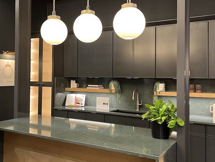
What makes a consumer choose one product over another? While many factors influence a person’s decision making process, color can have a significant effect on human behavior. From influencing the perceived taste of food to defining a brand’s personality, color can communicate a spectrum of feelings without saying a word.
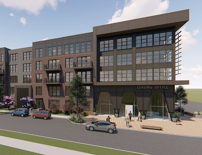
This concept applies to atmosphere as well; the right color palette in a room can change its mood and ultimately create a more inviting space. When designing a multifamily residence, factoring in residential color trends is crucial to producing a modern and aesthetically pleasing environment.
Few companies understand this better than PPG Paints, which creates colors and finishes for leading manufacturers of electronics, vehicles and other consumer products, as well as wall paints and finishes for commercial and residential buildings. Each year, a color forecast meeting is held amongst representatives of the automotive, aerospace, architectural and consumer products industries in order to determine one color of the year and four trend-driven color collections.
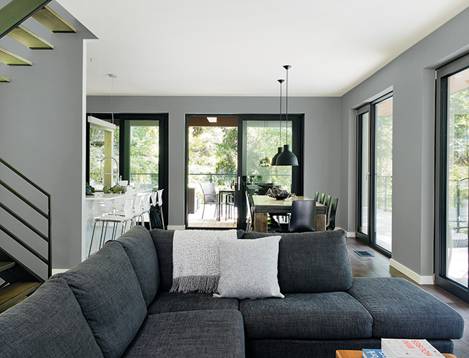
This year, the color selected by PPG for Color of the Year is a subtle green called Paradise Found. Less bold than deeper forest greens but still organic in feel, Paradise Found is “amazingly versatile,” according to Dee Schlotter, senior color marketing manager at PPG Architectural Coatings. “It feels welcoming and relaxing.”
The remaining trend selections were broken into four collections: I/mPerfect, Hyper HD, Lucid Dreams and Knight’s Watch.
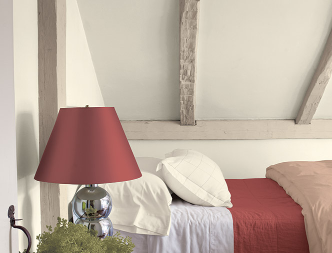 I/mPerfect: A nature-inspired collection of nuanced off-whites, sage greens and desaturated reds are featured. “Pigments discovered in nature influence the majority of this palette, yielding saturated and blended hues that hint at a vintage and mildly bohemian spirit,” according to the company.
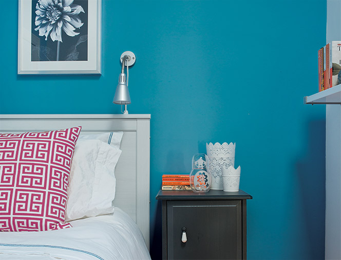 Hyper HD: A bright and colorful palette, Hyper HD aims to reflect the influences of the tech world with its choice of lacquered, satin or chrome finishes. The bright fuschia and turquoise choices are complemented by the softer, more neutral tans and browns.
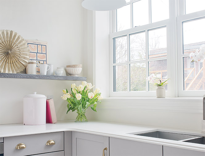 Lucid Dreams: Soft peach and yellow pastels and light neutrals combine to create an expression of softness. Matte or high-gloss finish options bring out the nuances of delicate shades.
 Knight’s Watch: Color selections from Knight’s Watch are meant to convey a strong, industrial feel with varying shades of green, gray and brown. Glossy finishes mimic the look of oil while mattes are brushed with metallic accents.